Community, Design, Local authors, Marketing, Reading, Self Publishing, Writing

Cozy Mysteries on the Washington Coast – Q&A with Author Jan Bono

After retiring from teaching in 2006, Jan Bono began to write—and she hasn’t stopped since! Author of the six book Sylvia Avery series, Jan is also a prolific Chicken Soup for the Soul contributor and has been published in the series over 45 times, making her one of the top worldwide contributors. We love working with Jan, and recently asked her to share with us a little about her printing experience.

Author Jan Bono

Gorham Printing: You’ve recently completed the sixth book of your Sylvia Avery Mystery series. Can you tell readers a little about the series and what you wanted it to represent?

Jan Bono: Sylvia Avery is a middle-aged, fairly active woman who took early retirement on the North Beach Peninsula. She often finds herself tangled up in her friends’ lives, particularly when they’ve got trouble on their hands. Fortunately, Syl has a mind for mystery, and contributes quite a bit to solving the crimes that take place all around her—whether drug running, recent or cold-case murders, robbery, insurance fraud, kidnapping, and the like.

I’ve always loved reading mysteries, particularly “cozies,” and often I find myself wondering “What if” the events in the books, or even in real life, had happened a little differently. After 30 years in the classroom, I wanted to try my hand at making the community I live in a backdrop for the stories I had rolling around in my head. Writing a mystery series was on my retirement bucket list, and I took the bold move of starting this new endeavor in my mid-50s. After all, I retired from teaching, but not from life!

GP: Did your writing process change significantly from the first book to the sixth?

JB: The process? Not at all. My writing? Well, I like to think I improved as I wrote along! But my process did get a lot more detailed. Since the fall is my Season of Selling at holiday bazaars and craft fairs, I start most books in January by typing up all the notes and reading and summarizing my thick file of research. February is dedicated to writing a thorough synopsis. My definition of “thorough” has evolved from 18 to 20 single-spaced pages to over 40 pages for the last few books! Then I walk away for several weeks and leave the synopsis alone.

Between mid-March and mid-April, it becomes TIME TO WRITE! And although I have a very complete story summary, that doesn’t mean it can’t change, and often does! Characters I thought were only around for one book worked their way into my heart and I couldn’t bear not to carry them into the next book or two or even three! I’ve even changed “the bad guy”—twice—because I changed my mind about his or her intentions as I wrote. The synopsis is never in stone, but it helps me know where I’m eventually headed as I write.

GP: How long did each book take to write and edit?

JB: When I’m ready to start writing in earnest (about three months into the research and summary writing), I’m like a dog worrying a bone. I write first thing in the morning, every morning, and don’t quit till I have at least 1,000 words. Some days I just can’t pull myself away from the computer, and during the writing of Book 6, I wrote 1,500 daily words minimum, and on my most productive day I put down over 3,500 words!

When it’s my best effort at a first draft, I send it off to four or five friends to proof/edit/comment on it. And I only give them two weeks! I compile their notes, make corrections as necessary, and send it to my final reader, who somehow always manages to find another 20 or so things for me to review!

I like to say that the first book took me 31 years to write, but after that, it got much faster! HA HA! The last three books took 42, 42, and 39 days at the keyboard, but that was working from a very detailed synopsis. And it was so much fun! Then off to my proofer team (I had almost 30 people offer to help, but chose 5 or 6 readers for each book, and no one except my final reader read more than two first drafts). Then off to the printer! Start to finish, I averaged 5 to 6 months from first day of work to holding the finished product in my hand.

GP: How do you prepare your books for printing?

JB: I’m far from a computer geek, but there are some important things I’ve learned about formatting along the way. The Gorham Printing Manual was my bible in the beginning, but I also found that once I visualized the finished product, I could make it look on paper the same way it looked in my imagination! The manual clearly delineated the necessary components, and a retired teacher can certainly follow a lesson plan, but I also put different headers on alternate pages, chose my own font, and decided that 12-point, although it costs more to print more pages, was easier on “mature eyes,” and my regular reads are grateful for that! Then, after my proofreading team was finished with it, I made the corrections and sent the polished interior text folder to Gorham as a PDF with fingers crossed.

GP: We’ve been able to partner with you to do design work on the Sylvia Avery book covers. What was the design process like for you? What made you decide to work with a designer?

JB: Once my text was complete, I settled down to write the back of the book blurb, the author bio, take the selfie for my author photo, acquire an ISBN, and find—or take—a photo for the wrap-around cover. All these pieces went into another file for the book designer’s help, as I don’t know how to work photoshop, and I’m grateful I don’t need too! I worked with a designer’s HELP. I was glad there was an option between having it done for me, and doing it all on my own! The designer got all the pieces, and since I worked with the same one for the last four books, I greatly appreciated the fact that she soon learned to read my mind, and see my vision as I did. We communicated through emails, and I truly love the results of all our collaborations, without reservation. She made proofs that always surprised me, adding touches I hadn’t thought of, but that always looked fabulous!

GP: These books take place on the Long Beach Peninsula, where you live. What is it like writing about the place you live? How do your surroundings inspire you?

JB: On page 5 of each book is a map of the fictitious “North Beach Peninsula.” And yes, it looks just like the Long Beach Peninsula, in the SW corner of Washington State, but I’ve changed the names of the towns, bays, lighthouse, and other important landmarks, businesses, and features. In my series, Ilwaco, on the southern end, became Unity, which is actually what Ilwaco was briefly called at the end of the Civil War. Long Beach was founded by the Tinkers, and was Tinkerville for many years, but in my books it’s Tinkerstown. Oysterville has been replaced by the now-defunct community of Willoopah, which I moved across the bay to suit my purposes!

The Clamshell Motel was once the Tide Motel, a bit south of Cranberry Road, and the High Tides Burger Bar is still our long-time Corral Drive-In. Sadly, the Long Beach Coffee Roasters, which I renamed the Sandy Bottom Coffee Cup, is no longer in business, but my Buoy 10 Bakery, now Dylan’s Cottage Bakery, is right there in downtown Long Beach, and still makes the best pastries to eat while solving crimes anywhere on earth! My all-time favorite fictional restaurant name is Cinco Amigos’ Chinese Cuisine! In my first book, five Mexican friends decided to open an ethnic restaurant, but realized the local need was for Chinese instead of another Mexican food stop, and I let them take over the real-life Chen’s location. The name came to me when I thought about Five Guys Burgers and Fries, and I love the way people respond when first encountering Cinco Amigos’ Chinese Cuisine.

I’ve included aspects of the Crab Pot Tree Lighting, the Blues Festival, the Boardwalk, and many other true area events in my locales. Those things are real, but the Spartina Point Casino and Resort name is making a glamorous joke of spartina, which is actually a noxious weed that has been eradicated from Willapa Bay, or Shallowwater Bay, if you prefer! And The Veiled Rainbow, a geriatric belly dancing troupe, certainly exists, but not under that name. As I’ve said, writing is unlimited creative fun!

GP: Now that the Sylvia Avery mysteries are complete, what’s next on the horizon? Will you start a new cozy mystery series?

JB: A cozy series has no graphic violence, no obscene language, and no explicit sex scenes. It has an amateur sleuth working with the police department in a small town, quirky characters, and lots of laughs. When I finished the series, I already had a couple books in mind, just begging to be written. But the first on the list wasn’t in my usual “humorous” style, and I wasn’t sure if I was up to the task of writing more dramatically, with suspense and tension and all that I’d need to write a solid true crime, which I’ve been sitting on for 25 years. I will write it, but that book is now second on my list, as I “practice” writing drama! The practice book will end up being 8 or 10 short stories about how women ON THE PENINSULA are able to get away with bumping off their husbands or boyfriends in unusual ways! This will be my transitional book, and then I’ll tackle the harder one. That’s my plan at this moment! And yes, Gorham will be printing this one too. Gorham has printed 12 of my 15 books, and I see no reason to do it any other way!

GP: Where can readers find out more about you and your books?

JB: This darn pandemic has certainly thrown a wrench into my marketing plan! Whereas I usually sell the majority of my books at holiday bazaars in the fall, I’m now focusing on online sales. If you live within 25 miles of Long Beach, I can meet you at a public place in your area to deliver them, but any farther has to go through the mail. My website, where you can read a short synopsis of each book, is http://www.JanBonoBooks.com. There are several ways to contact me through the website, and I answer all inquiries. If you get the recorder, please leave a message! But first, check out my body of work at JanBonoBooks.com. Got it?  Thank you! And thanks to Gorham for this opportunity to tell you about my Sylvia Avery Mystery Series! I couldn’t /wouldn’t have done it without them!

It’s always fun to see a new book from Jan and know that we get to partner with her to design the covers. You can learn more about our cover design process by clicking here, or give us a call to get a custom quote for your book design!

Design, Marketing, Page Layout, Self Publishing

How to Design Your Book Cover Like a Professional

How is a great book cover made? Many people like to think that a great cover just materializes, fully formed, in the mind of the designer. The reality is that many factors, such as visual appeal, color, fonts, and audience, all have to be considered before starting. Additionally, a book designer must have the technical skills to put those ideas into print.

Here are four tips on designing your cover from a professional book designer.

1. Think About Your Audience

When creating your book cover, it is critical to consider where your reader will be seeing your book, what they will be looking for, and the feeling or tone of covers in that genre. Before starting your design, I recommend looking online and at local bookstores for books in the same genre as your book.

A fiction cover should appeal to the heart. What is the mood or feeling of your book? If you can pinpoint this, with a little searching, you will certainly be able to find an image that conveys that feeling. You may have better luck searching for concepts rather than things. So searching for “alone” or “lonely house” may provide you a better image than “lost cabin in the woods.”

Common photographic themes that can provide mood:

  • Dark Clouds
  • Shadows
  • Light Rays
  • Facial Expressions

A nonfiction cover should appeal to the mind. A metaphor will get the buyer thinking about what the book may be about. When choosing images, download a copy or sample of any image that you are considering. Try each of your ideas on the cover design with the cover type to see which one is the best before you pay.

2. Keep It Simple

One of the most common mistakes made in book cover design is overcomplicating the cover imagery or being too literal with it. Choosing one image or a direct focal point in the cover image will help your cover be more understandable and more enticing to potential readers. Ask yourself: if you were to drive down the highway and see a billboard of your book’s cover, would you be able to understand and determine what it is at a glance?

3. Focus On Your Title

Your readers need to know what your book called, which means they need to see your title as soon as they see the cover. Making the title your focal point will help direct your readers’ eye and entice them. Part of making your title the focal point is choosing the right font and size.

Choosing a serif vs. sans serif type face: Serifs are generally used more on literary or historical book covers. Sans serifs are used often on thrillers or on non-fiction. Here is comparison of the two types:

Choosing the right font: While it is tempting to choose a “fancy” face, resist this temptation. Many of these treatments absolutely guarantee an unprofessional cover design. Here are a few recommended typefaces:

Placing the type on your cover. It may seem a bit traditional, but you can’t go wrong with centered type! Keep your contrast as high as possible by using pure white type over a dark image, and pure black over a light image. When formatting your title, you may want to use wide letter spacing if your type is going over an image. If your background image is simple, you can choose a type with thinner letters. If the background image is busy, choose a heavier typeface.

4. Rule of Thirds

This is a common guideline or best practice for photography but also relates to book covers. The rule of thirds is a composition style that recommends that you divide your artwork into three main sections, each taking up one-third of the cover. For example, your focal point (usually your title or center element) will take up one third of your cover, while the remaining two thirds would be left open for background elements. Your sections can be divided, vertically, or diagonally. Below is an example cover that utilizes the rule of thirds:

Following these four tips will help give your book a professional look and make it standout among the crowd. Designing a cover should be fun and most importantly it should be something you love.

Check our our cover design portfolio and text design portfolio for a little inspiration.

Book Printing Cost, Book production, Design, Marketing, Self Publishing

How to Choose the Right Book Cover Finish: Matte vs. Gloss vs. UV

When I’m in a library or bookstore searching for my next adventure in reading, it’s a total sensory experience. From the smell of paper to the feel of the cover, choosing a book becomes about more than just the content on the page. Part of this experience is the cover finish on a particular book. Whether it’s the glossy art book or a matte novel, the cover finish you choose will affect how a reader perceives your book.

The type of cover finish you choose should be considered in tandem with cover design since it will complement your cover artwork. Think about the visual impact of your final book as well as how it will feel to the touch. Whether it’s on a living room coffee table or on a bookstore shelf, the right cover finish can be the difference between your book being noticed or not.

The three most common cover finishes for books are UV Coating, Gloss, and Matte. They are all terrific options, each with its own benefits and appeal depending on your book.

UV Coating

If you’re looking for a cost-effective cover finish, you can’t go wrong with UV Coating. UV Coating is a liquid solution poured onto your cover that is then cured using ultraviolet and infrared lights. This cover finish will give your book a bit of a shine, and will help protect your book against curling. It won’t peel and is more pliable than other finishes.

If your book’s cover is a solid color or a dark cover, you may notice smudges, fingerprints, and scuff marks more easily with UV Coating.

UV Coating is the best option if you want to keep your production costs low, or you want a look somewhat between gloss and matte. This finish option is versatile, making it a terrific choice for genres from fiction and history to textbooks and manuals.

Gloss Lamination

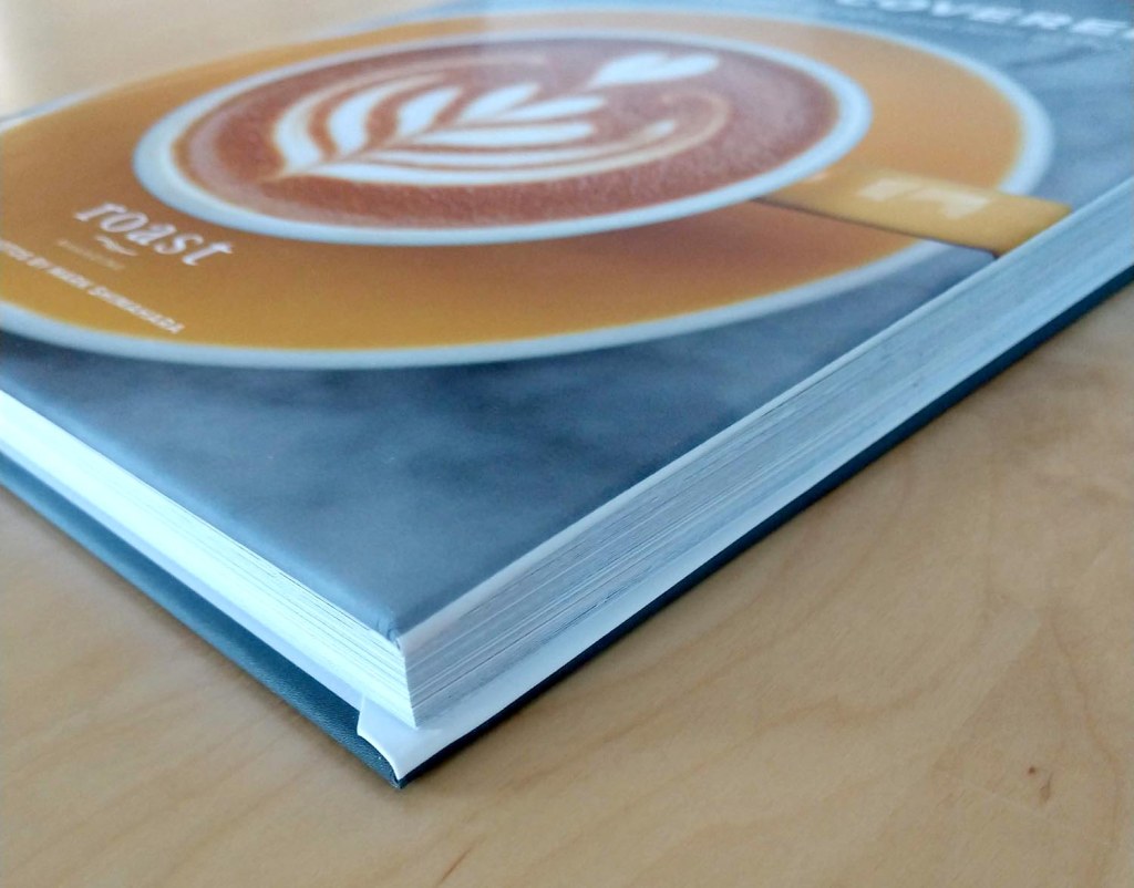
Gloss lamination is a reflective film that is stretched across your book’s cover. Gloss lamination provides increased shine and surface protection. This durable cover finish option will repel fingerprints or smudges, and is easy to wipe clean if it comes into contact with dirt or dust.

Books with a gloss laminated cover finish have a smooth texture and polished look that will enhance your cover by giving vibrancy to your photos and artwork. The reflective surface will surely grab attention from a bookshelf or coffee table.

You should choose a glossy finish for your book if you are looking to make a high impact, if your cover design is bright and vivid, or if you are looking for the most protection from scratches or dirt for your book. Gloss lamination is also reasonably priced if you are looking to upgrade from UV Coating. If you are interested in adding a premium feature like metallic printing, gloss is the best choice to pair with it.

Popular genres with gloss lamination include textbooks, cookbooks, art or photography books, and children’s books.

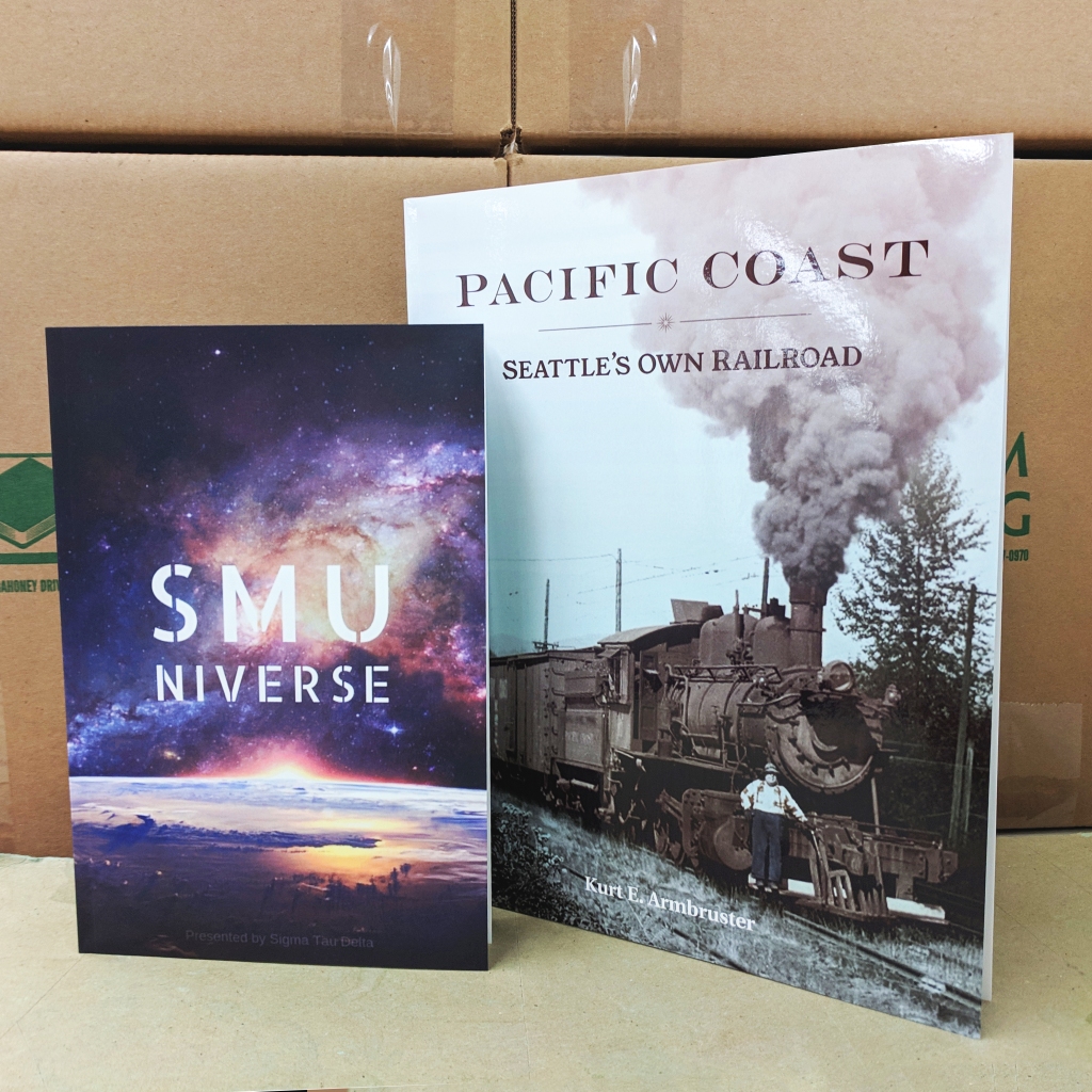
Matte lamination is a film overlay that results in a muted look for your cover and a velvety texture. Matte lamination offers a pleasant tactile experience and has an overall softer look. The less reflective overlay gives a more natural look to cover art, with a lower contrast on darker colors.

One of the benefits of matte lamination is that it is resistant to small scratches and scuffs. While wear and fingerprints are more readily absorbed with this finish, it can be more susceptible to stains and spills.

Besides producing a pleasing texture, this cover finish offers a unique, distinguished look. Where glossy books may be more common, one with a matte cover will really stand out from the crowd. For our 3D Spot UV premium feature, matte lamination is the way to go. 3D Spot UV is a raised and reflective overlay that contrasts beautifully with the muted look of matte lamination.

We see matte lamination used often for history books, memoirs, or poetry books.

How to Choose the Best Cover Finish for Your book

When deciding on the cover finish for your book, take into consideration your genre and intended audience. Browse your local bookstore for similar books and see what speaks to you. Whether you use film lamination or UV Coating, each style will have different impacts on the colors and artwork used in your cover design. The finish affects the visual and tactile experience of shopping or reading a book, as well as the perceived quality and value of your book.

What cover finish will work best with your project? Call us to talk about your lamination options! Jennifer and I can discuss the vision you have for your book and help pick the best choices for your cover finish.

Book Printing Cost, Book production, Self Publishing

The Best Binding Type for Your Book – Pros and Cons

A few months ago I moved into a new apartment.  Some of the first boxes I tackled when I was unpacking were my 500+ books. I organized them by spine color, creating a wall of book art in my living room.

As I placed each one I was struck by the different feelings each book evoked. We’re not supposed to judge a book by its cover, but if we’re judging favorably, is it such a bad thing? Each spine, whether a beautifully illustrated softcover or a timeless, foil-stamped hardcover, spoke volumes.

One of the first questions we ask when speaking to an author getting ready to print their book is “What binding style would you like?” Often a client will have this answer at the ready; in other cases, the author has not considered this before. Don’t let this decision get you in a bind!

Here are some pros and cons to consider when deciding between hardcover, softcover, or spiral binding.

Hardcover Books

Hardcover Book Binding

Pros of Hardcover Book Binding

  • Printed hardcovers (with a color image wrapped around the front and back) offer a high impact look.
  • Clothbound hardcovers with foil stamping have a classic look. Additional features like dust jackets and ribbon markers make it easy to imagine your book on a library shelf!
  • PUR adhesive binding makes these books extremely durable.
  • Hardcovers are long lasting and make great keepsakes.
  • Premium features such as custom foil or cloth colors, embossing, and custom endsheets will take your hardcover to the next level

Cons of Hardcover Book Binding

  • Hardcovers are more expensive than other binding styles.
  • Production time is 4-6 weeks.
  • Hardcover books dos not lay completely flat.

Softcover Books

Softcover Book Binding

Pros of Softcover Book Binding:

  • Softcovers are light and portable.
  • They are extremely cost-effective.
  • Shipping will be less expensive due to the soft cover and uncoated paper, which is more lightweight than coated paper.
  • There is a quick turnaround, most orders taking 5-10 business days in production.
  • Plenty of premium features are available, like 3D Spot UV, metallic printing, and embossing, help make your softcover book stand out.

Cons of Softcover Book Binding:

  • Coated paper stocks are incompatible with softcovers.
  • The perfect binding may not have the elegant feel of a hardcover book.
  • Softcover books do not lay completely flat.

Spiral Bound Books

Spiral Book Binding

Pros of Spiral Book Binding:

  • Opens completely flat or folds backwards.
  • Many different colors of spiral to personalize your book.
  • Wire-o binding is an inexpensive upgrade for a professional, polished look.
  • Several premium features, such as foldouts and inside cover printing, are available for spiral books!

Cons of Spiral Book Binding:

  • Page counts larger than 450 will not work with spiral binding.
  • Spiral books may not have the polished feel of a softcover book.
  • When shelved, the book title is not visible on the spine.

I recommend letting your book’s genre and intended audience guide you when deciding on a binding style. A cookbook or journal is perfect for spiral or wire-o binding. If your project is a family keepsake meant to be passed down to future generations, a clothbound hardcover will last for years and look fantastic on every bookshelf. And you can’t go wrong with a softcover for the majority of genres, from novels to coloring books to photography books. If you are hoping to reach a wide base of customers, softcover books are reasonably priced to produce and you will be able to pass those savings onto your readers.

Take some time to peruse your own bookshelves or favorite bookstore for books with similar genres to yours. You will get plenty of inspiration when choosing which binding option is best.

Jennifer and I are available by phone or email to discuss your project and use our knowledge and expertise to help you find the right fit for your book!